Effective data visualization is a critical skill for any Data Analyst and Analytics Engineer. Data visualization apart from being an effective way of providing insights to customers and businesses can also be a very useful tool during the analysis. There is a variety of techniques and software for creating data visualizations. However, it’s important to use best practices to ensure that your visualizations are accurate, informative, and engaging.
In this blog post, we’ll explore some of the chart types that exist and best practices for data visualization.
Selecting Appropriate Chart Types
One of the most important aspects of data visualization is selecting the right chart type for your data. Different types of data lend themselves to different types of charts, and choosing the wrong chart can obscure important insights or make your data difficult to interpret.
For example, if you’re trying to show the distribution of a numerical variable, a histogram or density plot might be more appropriate than a bar chart. Or, if you’re comparing two sets of data, a scatter plot might be more appropriate than a line chart.
But let’s dive a bit more into the different chart types and discover some of them:
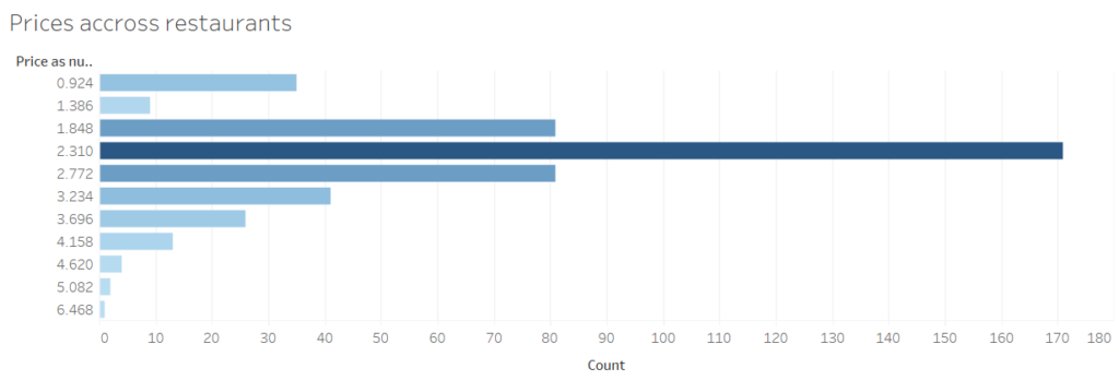
Bar Charts
A bar chart is a common chart type that represents categorical data. It consists of a series of bars, with the height of each bar representing the value of the corresponding category. Bar charts are useful for comparing values across categories and can be easily customized with different colors, labels, and other visual elements.

Best practices:
- Use a consistent color scheme throughout the chart to make it easier to compare values.
- Avoid using too many categories, as this can make the chart difficult to read.
- Use clear and descriptive labels to help viewers understand the data.
line charts
A line chart is a chart type that represents numerical data over time or other continuous variables. It consists of a series of data points connected by lines. Line charts are useful for showing trends over time and can be easily customized with different colors, labels, and other visual elements.

best practices:
- Use a consistent color scheme throughout the chart to make it easier to compare values.
- Use clear and descriptive labels to help viewers understand the data.
- Use appropriate markers or data point shapes to distinguish between multiple lines.
scatter plots
A scatter plot is a chart type that represents the relationship between two numerical variables. It consists of a series of data points, with each point representing a value for both variables. Scatter plots are useful for identifying patterns or trends in the data and can be easily customized with different colors, labels, and other visual elements.
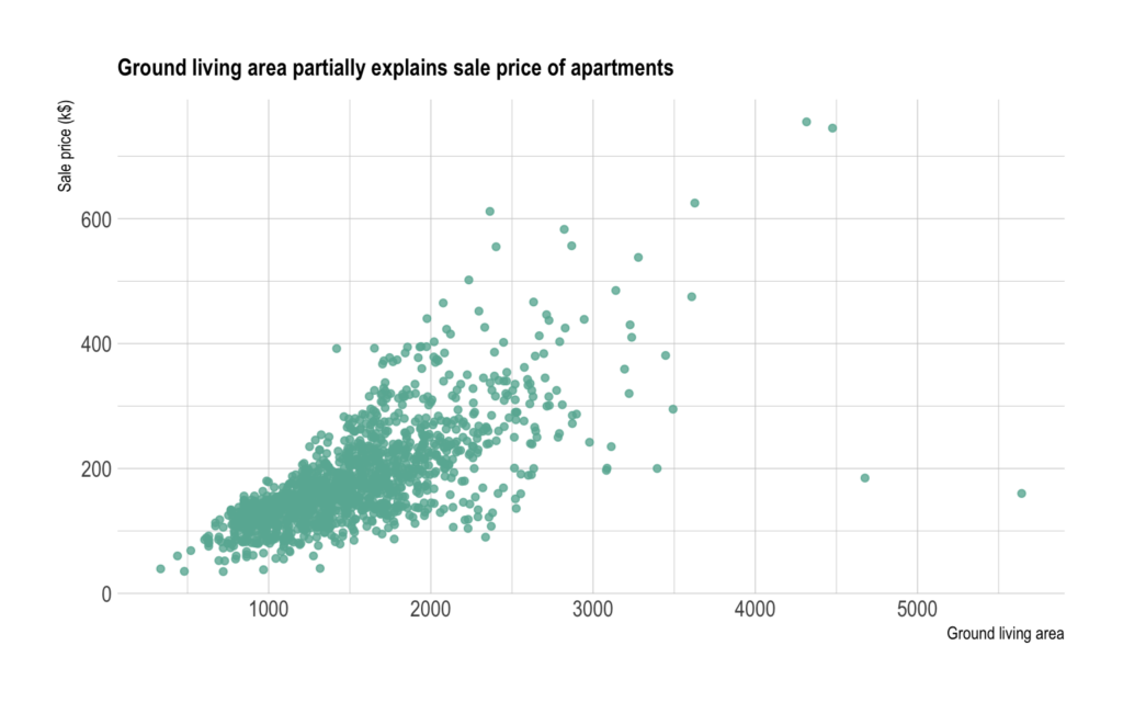
best practices:
- Use a consistent color scheme throughout the chart to make it easier to interpret.
- Use clear and descriptive labels to help viewers understand the data.
- Use appropriate markers or data point shapes to distinguish between different groups or categories.
pie charts
A pie chart is a chart type that represents the proportion of different categories in a dataset. It consists of a circle divided into slices, with each slice representing a different category and the size of the slice representing the proportion of the category. Pie charts are useful for showing the relative sizes of different categories and can be easily customized with different colors, labels, and other visual elements.

best practices:
- Limit the number of categories to no more than 6 or 7 to make the chart easier to read.
- Use a consistent color scheme throughout the chart to make it easier to compare values.
- Use clear and descriptive labels to help viewers understand the data.
heat maps
A heat map is a chart type that represents the distribution of data across two or more dimensions. It consists of a grid of squares, with each square representing a value in the dataset and the color of the square representing the value. Heat maps are useful for identifying patterns or trends in the data and can be easily customized with different colors, labels, and other visual elements.
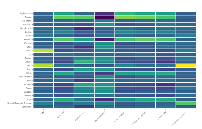
best practices:
- Use a consistent color scheme throughout the chart to make it easier to interpret.
- Use clear and descriptive labels to help viewers understand the data.
- Adjust the size of the squares to ensure the chart’s visual balance.
histograms
A histogram is a chart type that represents the distribution of data over a continuous range of values. It consists of a series of bars, with the height of each bar representing the frequency of values within a specific range. Histograms are useful for identifying patterns or trends in the data and can be easily customized with different colors, labels, and other visual elements.
best practices:
- Choose the appropriate bin size to ensure the chart’s visual balance and information.
- Use a consistent color scheme throughout the chart to make it easier to compare values.
- Use clear and descriptive labels to help viewers understand the data.
Box-PLOTS (Whisker) Plots
A box-whisker plot is a chart type that represents the distribution of data across different groups or categories. It consists of a box that represents the middle 50% of the data, with whiskers that represent the range of the data and outliers displayed as individual points. Box-whisker plots are useful for comparing distributions between groups and can be easily customized with different colors, labels, and other visual elements.
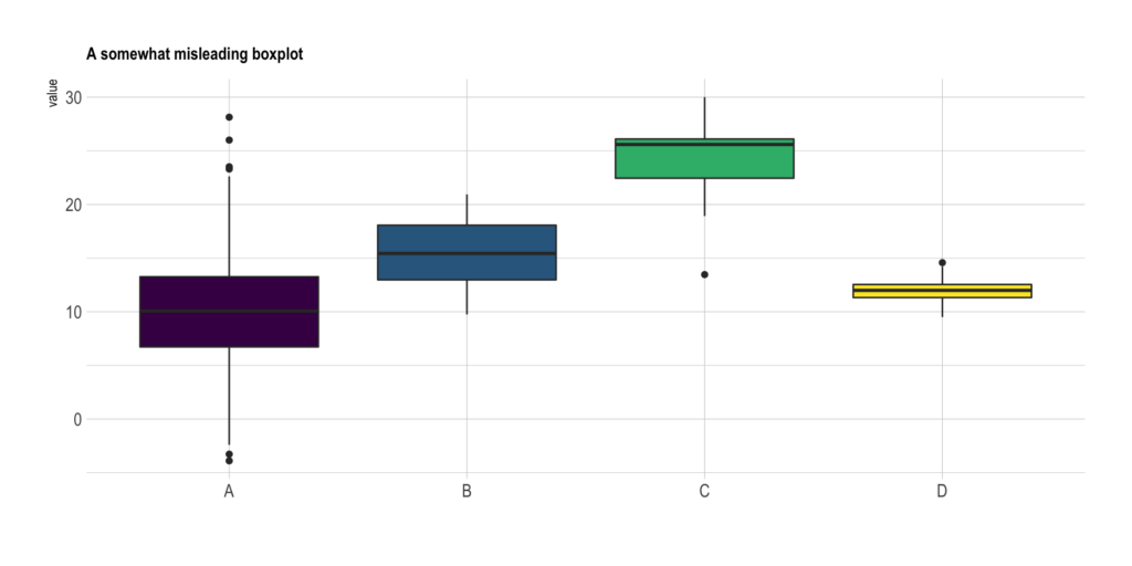
best practices:
- Use a consistent color scheme throughout the chart to make it easier to compare values.
- Use clear and descriptive labels to help viewers understand the data.
- Adjust the scale of the y-axis to ensure the chart’s visual balance.
maps
A map is a chart type that represents geographical data. It consists of a visual representation of geographic regions, with data displayed using colors, symbols, or other visual elements. Maps are useful for visualizing spatial patterns and relationships in the data and can be easily customized with different colors, labels, and other visual elements.
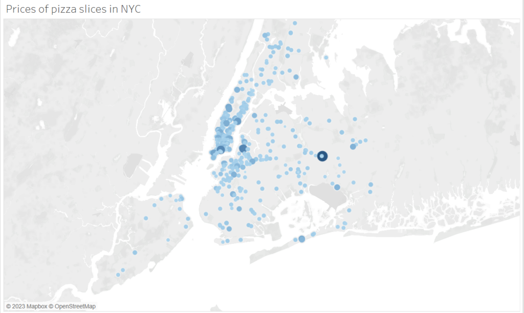
best practices:
- Choose an appropriate map projection that accurately represents the geographic region.
- Use a consistent color scheme throughout the chart to make it easier to compare values.
- Use clear and descriptive labels to help viewers understand the data.
treemaps
A treemap is a chart type that displays hierarchical data in a nested format. It consists of a series of rectangles, with the size of each rectangle representing a value or proportion of the total. Treemaps are useful for visualizing complex data structures and can be easily customized with different colors, labels, and other visual elements.
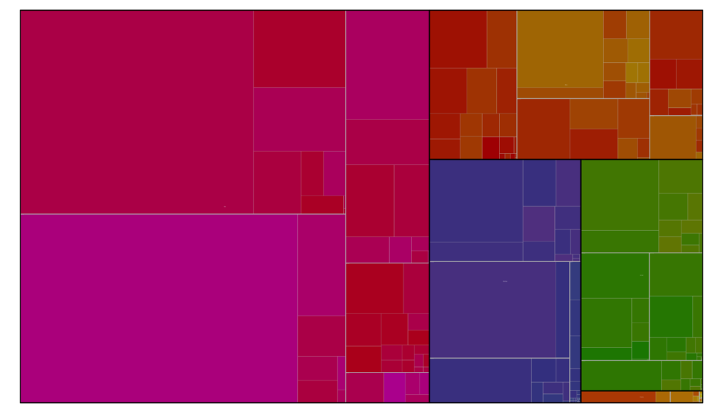
best practices:
- Use a consistent color scheme throughout the chart to make it easier to compare values.
- Use clear and descriptive labels to help viewers understand the data.
- Ensure the visual balance of the treemap to make it easy to navigate.
Customizing Visualizations for Specific Audiences
Furthermore, another important aspect of data visualization is customizing your visualizations for specific audiences. Depending on the audience, you may need to adjust the colors, font sizes, or other visual elements to ensure that your visualization is accessible and engaging.
For instance, if you’re presenting to a business audience, you may want to use a more subdued color palette and focus on the key insights of your data. On the other hand, if you’re presenting to a technical audience, you may want to include more detailed information and use more technical language.
Ensuring Accuracy and Clarity
Finally, it’s important to ensure that your visualizations are accurate and clear. This means checking your data for errors and inconsistencies and avoiding visual clutter or confusing elements in your charts.
For example, you may want to add labels or annotations to your charts to provide context and highlight important insights. Or, you may want to use a consistent color scheme throughout your visualizations to make it easier for viewers to understand and interpret your data.
Conclusion
To ensure that your visualizations are effective, you would need to select appropriate chart types, customize your visualizations for different audiences, and ensure that your visualizations are accurate and clear. By following these best practices, you can create data visualizations that are informative, engaging, and impactful.
References
https://help.tableau.com/current/pro/desktop/en-us/what_chart_example.htm
https://www.safegraph.com/guides/visualizing-geospatial-data