We have already seen how to get Snowflake to work with Python and how to get Snowflake data in convenient Pandas Dataframes. Today, we are going to see how we can use the recently obtained dataframe to create better plots with Streamlit.
Getting the Data
I have already mentioned that in a previous blog I explained how to obtain Snowflake data in a Pandas Dataframe, so for today I will assume that you have already gotten a Dataframe that you want to use for plotting.
If you want to follow the example that I am going to give, you con download the dataset that I created using the Lichess Open Database.
The dataset consists of +200000 reated chess games played in the Lichess website. The columns are
- GAME_ID: Unique identifier of each game.
- EVENT: Game mode determined by the time format of the game. Can be ‘classical’, ‘blitz’ or ‘bullet’.
- WHITE_PLAYER_ID, BLACK_PLAYER_ID: White and black players username in Lichess.
- OPENING_ID: Name identifying the opening and variation followd in the game.
- RESULT: Identifies the outcome of the game. Can be ‘1-0’, ‘1/2-1/2’ or ‘0-1’ for white wins, black wins and draw, respectively.
- WHITE_ELO, BLACK_ELO: ELO rating of players.
- GAME_DATE: Day where the game was played.
What is Streamlit
Streamlit is a basically a Front-End service that you can use even if you have literally no idea about Front-End (like me). It is extremely easy to learn, at least for basic stuff, and it is also very good looking in its default setting. Although, of course, they allow full-costumisation if you would ever want to go into that.
Check out their website on how to install it. After you have done that, you can simply import streamlit as st, create your app and the run with streamlit run app.py on the command line.
Let’s look at some of the basic functionalities that we are going to use in the example.
Magic
Yes, you’ve read that right. Streamlit offers a Magic functionality, which basically means that you can just introduce a variable and they will try to guess what to do with it. It is most commonly used for inserting markdown text, but it also displays, for instance, dataframes in a nice way automatically.
import pandas as pd
import streamlit as st

df = pd.read_csv('lichess_games_2013_06.csv')

"""
# This is a title

This is text that will be seen in the streamlit application. And we can continue with a list of items like:
- item1
- item2
    - subitem1
- item3
"""

df
The result after saving this in the app.py script and running it with streamlit run app.py will be seen in a new browser page that will show the following.
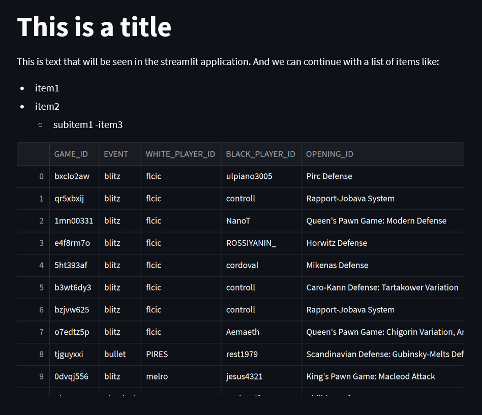
Pretty easy right? It shows both the string formatted Markdown style and the dataframe.
Input widgets
The idea is to make the visualization a little bit more fun and interactive to the user, and to accomplish that, we can use Streamlit’s input widgets.
"""# Age application"""

name = st.text_input('Introduce your name')
age = st.slider('Introduce your age', min_value=12, max_value=120)

button_pressed = st.button('Press this button')

if button_pressed:
    f"""
    Hey {name}! Nice to know that you are {age} years old!
    """
If we run our app, you will get a text input, a slider and a button. When you press the button, the code inside the if statement should appear on screen as text.
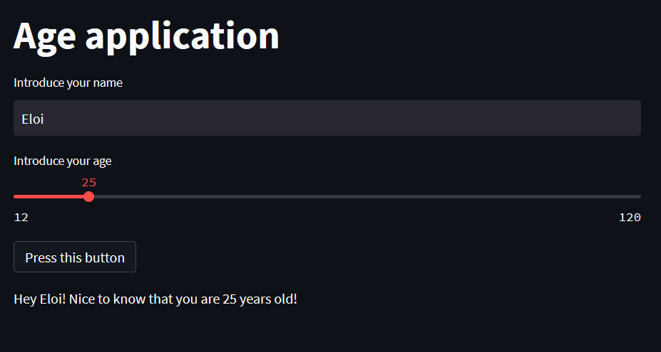
I know, I know… This is not precisely impressive… but! You have to agree with me, endless possibilities and ideas are starting to run through your mind on all the cool stuff you could do with this, right?
Plotting
Of course, being in the data field, we are mainly interested on visualizing data. Streamlit offers native support for several plotting libraries like matplotlib. However, even though matplotlib can create impressive plots for publication and prints, we would like to create something a little bit more interactive, which matplotlib does not handle really well. Instead, let’s use plotly!
import streamlit as st
import numpy as np
import plotly.express as px

x = np.linspace(0, 5)

y1 = np.sin(x - 1) + np.cos(x)
y2 = np.sin(x * x) * np.exp(-0.1 *  x * x)
y3 = np.cos(x * x) * np.exp(0.1 * x)

df = pd.DataFrame(dict(x = x, func1 = y1, func2 = y2, func3 = y3))

plot = px.line(df, x = 'x', y = ['func1', 'func2', 'func3'])

"""# Plotting app

Below you can see a plot made with plotly just as an example
"""

st.plotly_chart(plot)
The result of running this with streamlit will be the following.
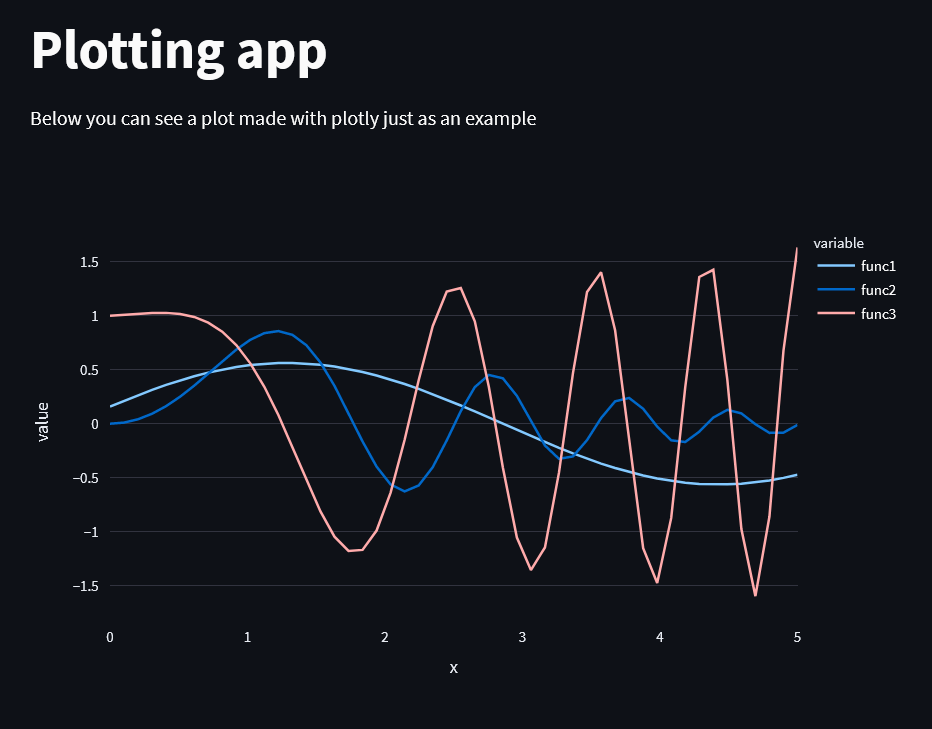
This does not look so different from a matplotlib plot, right? Wrong! This plot is fully interactive. The user can:
- hover over the plot to get information on any specific point
- resize the axes
- click on the legend to show or hide specific series
- …
Pretty nice! Especially considering how easy it was to code.
Putting it all together
Let’s actually put this into practice with our chess dataset. We are going to create an opening analyzer that can be used to look for general information or for specific players.
We will need:
- A text input where the user can look for a specific user or leave blank for information on all the dataset
- A slider for him to determine how many openings it wants to show
- A button that allows the user to the decide if he is looking for openings or variants (In general an opening can have a variant, which is then written as
variant = opening: description)
The final result is the following
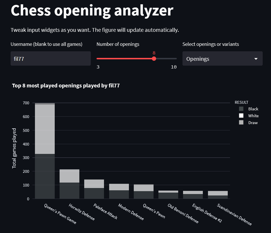
Look at this beauty! And it is so interactive!
The user can use all games on the dataset or focus on just one user, choose the number of openings that are displayed and whether to use openings or variants. And that is only as user input!
The plot allows the axis to be resized, to hover to get the specifics of white wins, black wins and draws, to click on the legend to hide a specific result…
With pretty little effort we have changed from creating a script that produces a set of predetermined static plots given a dataset to a script that actually creates an interactive Front-End. That’s the magic of Streamlit!
Below you can get the whole script that I used to create the streamlit app.
import streamlit as st
import pandas as pd
import plotly.express as px

# Plot parameters
COLORS = {
    'w': 'rgb(255,255,255)',
    'b': 'rgb(64,71,73)',
    'd': 'rgb(179,179,179)',
}

RSLTS = {
    '1-0': 'White',
    '1/2-1/2': 'Draw',
    '0-1': 'Black'
}

OPACITY = 0.9


def top_openings(df, username='', n_openings=8, variant='Openings'):
    op_df = df.copy()

    # Filter by user
    if username != '':
        op_df = op_df[
            (op_df['WHITE_PLAYER_ID'] == username) |
            (op_df['BLACK_PLAYER_ID'] == username)
            ]

    if op_df.empty:
        return -1, op_df

    if variant == 'Openings':
        # Get opening instead of variant
        op_df['OPENING_ID'] = op_df['OPENING_ID'].str.split(':').str[0]

    # Get top n openings
    top_op = op_df[['OPENING_ID', 'GAME_ID']]\
        .groupby(by=['OPENING_ID']).count()\
            .reset_index().sort_values(by='GAME_ID', ascending=False)\
                .head(n_openings)['OPENING_ID'].to_list()

    # Filter by only the top openings. Can probably be made easier!
    top_op_df = op_df[['OPENING_ID', 'GAME_ID', 'RESULT']]
    top_op_df['is_top'] = top_op_df.apply(lambda x: x.iloc[0] in top_op,
                                                axis=1)
    top_op_df = top_op_df[top_op_df['is_top']]

    # Count the top openings but keeping result information as well
    top_op_df = top_op_df.groupby(by=['OPENING_ID', 'RESULT']).count()\
        .reset_index()

    # Plot the top n openings
    fig = px.histogram(
        top_op_df,
        x='OPENING_ID',
        y='GAME_ID',
        color='RESULT',
        color_discrete_sequence=(COLORS['b'], COLORS['w'], COLORS['d']),
        labels={'GAME_ID':'Games played', 'OPENING_ID': 'Opening'},
        barmode='stack',
        opacity=OPACITY
    ).update_xaxes(categoryorder='total descending',)

    # Change legend names
    fig.for_each_trace(lambda t: t.update(
        name = RSLTS[t.name],
        legendgroup = RSLTS[t.name],
        hovertemplate = t.hovertemplate.replace(t.name, RSLTS[t.name])
    )
                  )

    # Change title, axes, ...
    title = f'Top {n_openings} most played openings'
    title += f' played by {username}' if username != '' else ''
    fig.update_layout(
        title=title,
        yaxis_title='Total games played',
        xaxis_title = ''
    )

    return fig, top_op_df


"""
# Chess opening analyzer

Tweak input widgets as you want. The figure will update automatically.
"""

# Load the dataframe
df = pd.read_csv('lichess_games_2013_06.csv')

# Create columns for better display of the input widgets
col1, col2, col3 = st.columns(3)

with col1:
    username = st.text_input('Username (blank to use all games)')

with col2:
    n_openings = st.slider(label='Number of openings',
                           min_value=3,
                           max_value=10,
                           step=1,
                           value=8)

with col3:
    variant = st.selectbox('Select openings or variants',
                           options=['Openings', 'Variants'])

# Call the function with the user input
fig, top_op_df = top_openings(df, username, n_openings, variant)

# If the returned dataset is not empty, plot the figure!
if top_op_df.empty:
    st.warning(f"""No games found with current username. Try with one of these:

               fil77, tomi36, T91, amir51, traker100, calculus
               """)
else:
    st.plotly_chart(fig)