
Fan tokens have opened up exciting opportunities for fans to actively engage with their favorite sports teams and artists. These digital tokens, often built using blockchain technology, allow fans to have a real say in team decisions.
But have you ever wondered how a team’s performance can impact the value of these fan tokens?
In this blog post, I’ll guide you through our inaugural Python project on visualizing API data on Streamlit. A collaborative effort between myself and my colleague, Guillermo Izquierdo. We developed this project during our tenure at Nimbus Academy, where we set out a tool to explore the link between team performance and fan token prices.
What is a Fan Token?

Think of this as a digital badge that shows you’re a superfan of a team. On Fan Market Cap you can find some examples. It’s usually based on technology called blockchain.
For each Fan Token we considered in our project, we focused on two aspects:
Fan Token Price:
Determined by supply and demand dynamics on cryptocurrency exchanges or trading platforms where they are listed. Factors influencing its price include the team’s performance, exclusive benefits associated with the token, the overall crypto market sentiment, and the level of fan engagement and adoption of the token.
Fan Token Volume:

It refers to the total number of fan tokens traded on a cryptocurrency exchange platform within a specific timeframe, usually a day. It’s an indicator of the token’s liquidity and overall market activity.
Volume is determined by aggregating all buy and sell transactions of the token within that period. A high volume often suggests strong interest and activity for that token, while a low volume can indicate less market attention.
Monitoring fan token volume helps traders and investors gauge the popularity and potential price movements of the token.
Project Overview
Our journey into Visualizing API Data on Streamlit involved several important steps:
1. Brainstorming ideas for our project
To create an interactive dashboard that shows data from two online sources (APIs), we did some reading and found out about Fan Tokens and how their prices change.
2. Getting Data from APIs
To fuel our analysis, we started by collecting historical market data for fan tokens. We did this by making requests to APIs, which are special web tools that provide data.
- Fan Market Cap API: This source gave us past details about fan tokens.
- Football Data API: This source told us about football team scores and games.
3. Cleaning Data on Python
Data fetched from APIs isn’t always ready for analysis. We had to take several steps, such as tidying the data and adjusting the date formats, to make it usable.
4. Organizing Data with Snowflake
To keep all our data organized and safe, we used Snowflake. It’s a neat and secure place to store all our information. We could easily find what we needed when we wanted to use it for analysis by establishing a connection between our Python environment and Snowflake.
5. Visualizing with Diagrams
We created diagrams called Entity Relationship Diagrams (ERD) to help us understand how different pieces of data were connected. It’s a map of how everything fits together.
6. Making an Interactive Dashboard
With the help of Python and Streamlit, we built an interactive dashboard.
This dashboard would take the data from Snowflake and present it in an easy-to-understand way.
As we worked on the project, we consistently updated our Git repository as well as a comprehensive documentation detailing the dashboard’s functionalities, data sources, and user guidelines.
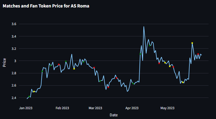
Visualizing API Data on Streamlit: the Fan Token Dashboard
Here’s a video that demonstrates how our interactive dashboard works. You can choose a specific time and pick teams to see the charts update accordingly.
Key Takeaways from Our Experience
We learned a lot from working on visualizing API Data on Streamlit. Not only the technical aspects but also aspects of working together.
- Examine API Details Thoroughly: Before initiating any project, it’s essential to delve into the specifics of the free APIs. This will ensure that the project is outlined effectively and efficiently.
- Prioritize Communication and Alignment: It is paramount to maintain clear communication and alignment while setting up the API calls. This ensures everyone is on the same page and minimizes misunderstandings.
- Establish Repository Structure Upfront: In the words of Abraham Lincoln, “Give me six hours to chop down a tree and I will spend the first four sharpening the axe.” Before diving into coding, it’s vital to agree upon the repository structure, including folder organization and naming conventions. This proactive approach can save significant amounts of time in the long run. Check out the Python Best Practices on our blog.
- Prioritize Readable and Commented Code: While machines execute the code, humans are the ones interpreting and maintaining it. Therefore, writing clear, comprehensible code with apt comments is not just a best practice—it’s a necessity. Always remember, clarity is king.
Conclusion
Overall, it was satisfying to see the dashboard working after all the work we put in.
The tool can definitely be improved in many ways, for example:
- Adding team logos to make the dashboard look nicer.
- Showing scorecards that compare current and past performances.
- Adding filters to see how teams do in local leagues versus European ones.