When we run a query we would like to have a quick overview of the results, to have an immediate picture of the quantities and data in the table on which we have applied filters.
Snowsight immediately produces in the results box some automatic statistics supported by simple, intuitive and even interactive graphs.
(Remember : to expand or shrink the results window, you can use shortcuts particularly convenient)
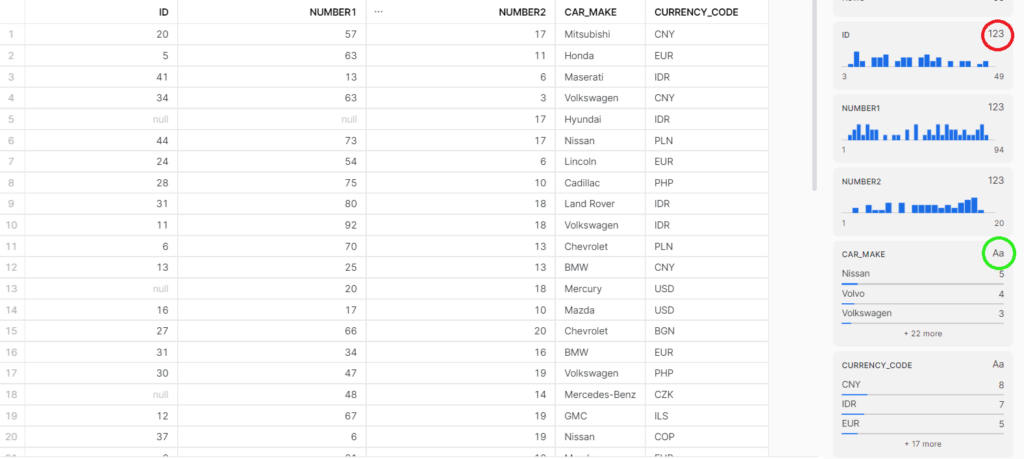
General overview
To show how this part of the interface works, I generated a dummy table in Mockaroo, with columns containing different types of variables (in this case only categorical and integer data).
Filled vs null
A first interesting piece of information is the percentage of unfilled fields, this feature is useful for figuring out at which rows there are null values in a specific column, based on this we can decide how to handle the data or how to interpret it if some values are missing. To get access to rows that have null values just press on the percentage of empty rows (as seen in the following video).
Numeric
To get access to the specific results of a column simply press on its header. For numerical data, a histogram is made available with the occurrences of individual values outlined with the average and sum values.
The interactive chart also allows the user to select customizable ranges of values. Statistical descriptors are automatically updated with the values for the range of interest. There is also an indication of the number of rows in the selected range of values.
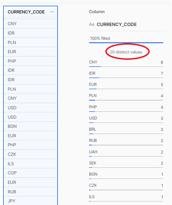
Categorical
For categorical data, in addition to the usual percentage of rows filled, there is a representation of a frequency distribution, which might be useful to begin to get an idea about possible grouping criteria in subsequent queries. Snowsight also communicates the number of distinct values the variable takes (circled).
Other type of data
We have seen the most frequent data types, but this tool provides representations and quantitative information for other types as well:
- Histograms for the for dates and for time variables
- The distribution of domains with regard to columns containing email addresses
- The distribution of keys for JSON files.